Modernism in Print Dutch Graphic Design 1917 2017
Modernism: in print
Dutch Graphic Design 1917–2017.
![]()
Written by Craig Berry
Designer & Writer

I would like to think that people who know me, my interests and style would know that I love modernist graphic design and also design history. So when I saw, back in April or May, that the UvA Bijzondere Collecties was planning an exhibiton based on modernism, archival ephemera, print and Dutch design I was pretty excited.
And after what seems like an age, th e exhibition is finally open to the public and visiting on the first Saturday of opening I thought it was one of the best design exhibitions I have been to in a long time. The work displayed showcases the wide spectrum of modernist art and graphic design whilst covering decades of history — showing the work of some of the 20th centuries greatest European graphic designers.
"In the first decades of the 20th century, a relatively small group of European painters and architects began to experiment with typography. The source of this radical innovation can be found in abstract art. The predominantly left-wing avant-garde—operating under various ism's—rejected traditional, bourgeois ideas, partly unde the impact of the dramatic politic events taking place at the same time.
The Neoplasticism as propagated in and by De Stijl required a 'New Typography'. The graphic avant-garde of the 1920s put the primary focus on functionalism, with the modern designer being something of an engineer. The New Typography favoured standard paper formats like A4, and anonymously designed sans-serif typefaces. The movement fully embraced the machine and the possibilites offered by photography; the typesetting was asymmetrical. Designers from Eastern Europe and Germany often set the tone. There were also numerous contacts with kindred spirits active in the New Vision and Modernist Architecture movements.
In Switzerland, which remained neutral during WWII, Modernism was formalised into an 'International Typographic Style': what used to be playful and critical avant-garde now became corporate mainstream. In the 1960s the rational 'Swiss typography' prevailed in the public sphere, ranging from government publications to the house styles of major companies. Nevertheless, there was still room within the broader Modernist movement for the personal and political dimension, as reflected especially in posters and other graphic communications for the cultural sector. In the 1970s the wider public began to find the rational and matter-of-fact style that dominated institutional design irritating. For a number of designers currently active, however, this multiform movement has not lost and of its validity."
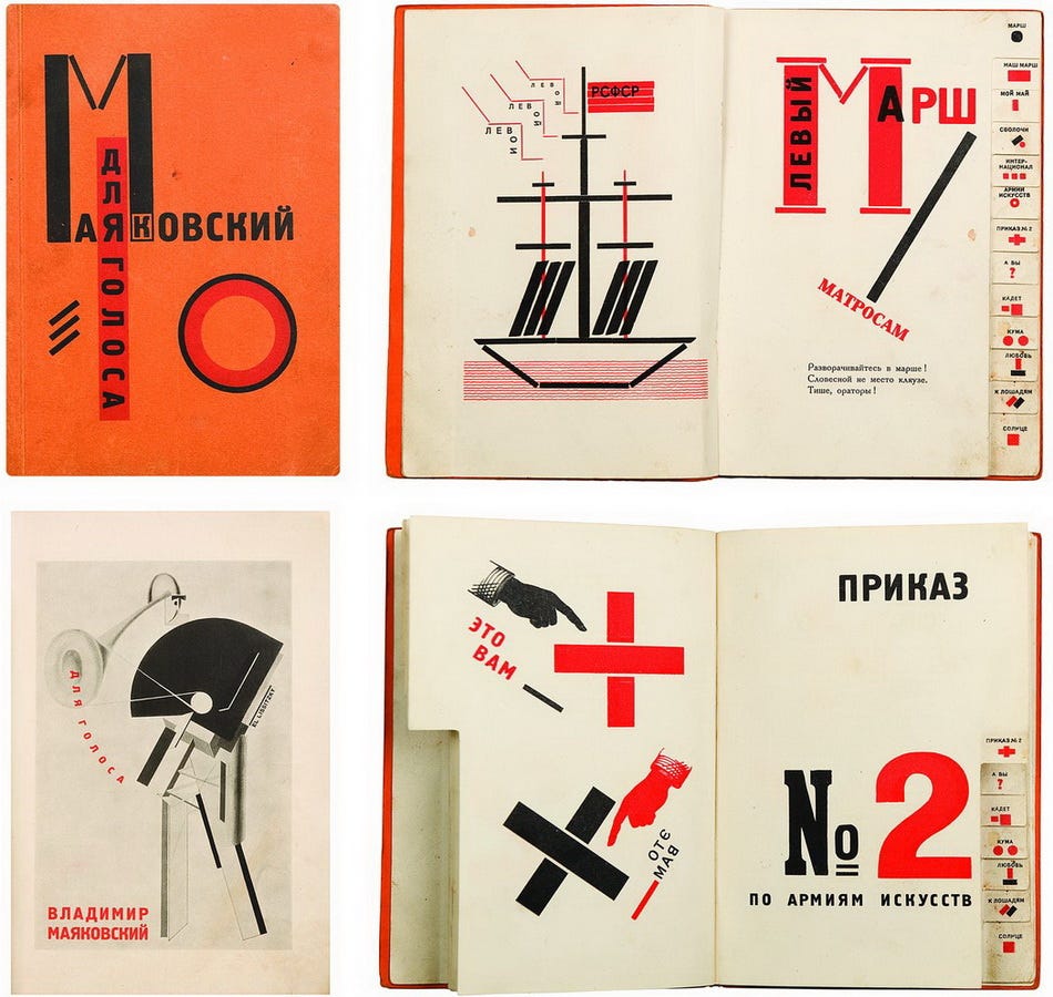
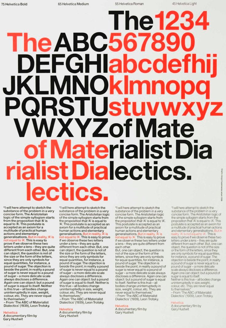
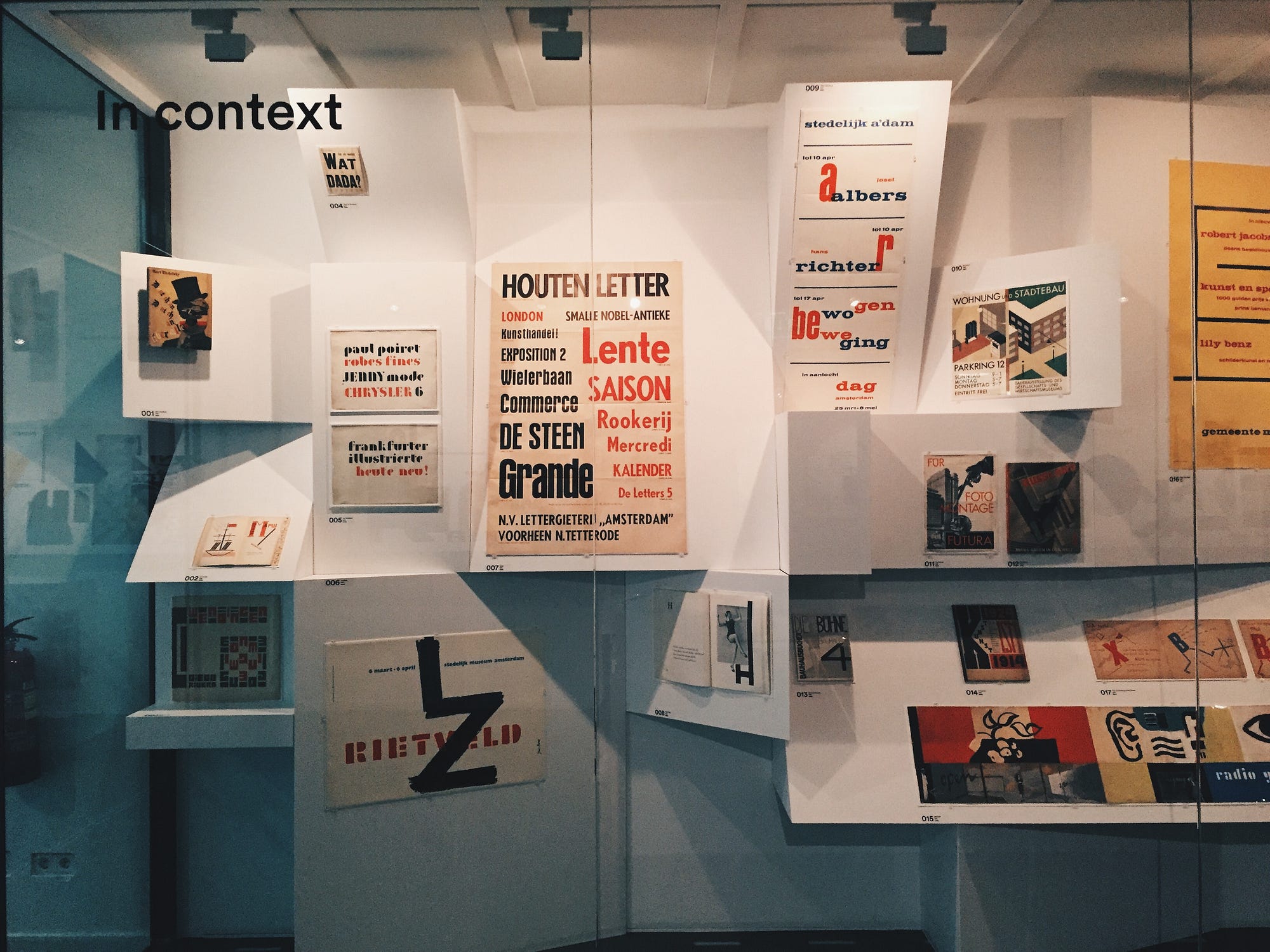
Upon walking into the first room of the exhibition space you are met with a vast amount of printed material and ephemera, it's difficult to stop and look at one single thing as everything is so pertinent and striking. A long glass display cabinet shows 'modernism in context' with posters, prints, books and book covers. The work ranging from 1923–2006 and all the years inbetween. Stopping to take it all in I can see, from the left: El Lissitzky's 1923 book design of Vladimir Majakovski's, 'Djla Golosa' and Theo van Doesburg's 1923 book cover, 'Wat is Dada?' all the way to 8vo's 1991 poster for the Museum Boijmans van Beuningen exhibition 'Friso Kramer: industrial ontwerper' and Experimental Jetset's 2006 poster for Gary Hustwit's Helvetica film, 'The ABC of Materialist Dialectics'. The variation in style over time is obviously a natural development but to see it here on a chronological scale is something special.


The broad range was great as you're able to see how modernism looked like when it was in its infancy and how it developed into what we know today. Some of the great stand-out pieces in this display for me where an original Deberny & Peignot 1964 Univers type specimen showing 21 variations of the typeface — my favourite typeface and the perfect alternate to Helvetica both released in 1957 and both based on the 19th century Akzidenz Grotesk. It is so consistent across weights but so diverse — for me it is the best grotesque sans-serif. It quickly became my favourite typeface after creating a publication based on its designer, Adrian Frutiger and his life — also the designer of Frutiger (1975) and Avenir (1988).

I also loved this poster for the Stedelijk Museum by Willem Sandberg in 1961. I visited a Sandberg exhibition in late 2016 and since then I have seen his designs and style so many times as it is so distinct and recognisable. Here the poster is for an exhibition of 'Josef Albers, Hans Richter, Bewogen Beweging'.
The design is so quintessentially Sandberg by the fonts used which were used across many of his Stedelijk posters and publications due to a lack of available fonts, the simple yet effective use of just red and blue on white makes it clear and clean and as Sandberg said himself: "red has to be in every poster."
It also follows his own rule in that "a poster has to provoke a closer look, otherwise it doesn't endure." Which is does, you can't glance at this poster and understand it straight away, the typography draws you in and you can't help but follow it downwards, picking up the information as you go.
There are too many things inside this cabinet to go into detail but it is honestly full of gems for graphic design history nerds like myself. Some quick highlights: multiple De Stijl magazine covers by Theo van Doesburg & Vilmos Huszar, typographic books by Jan Tschichold and Emil Ruder, original type specimens for Neue Haas Grotesk/Helvetica and Futura, prints by Karl Gerstner and Max Huber and posters by Wim Crouwel and Ralph Prins and more—this is only the first part of the exhibition.


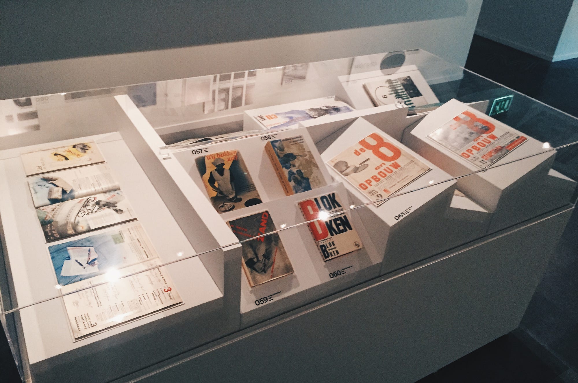
In this first room, besides this general overview was a section dedicated to modernism of the 1920s and 1930s aka 'New Typography'. A lot of the work here seeminlgy inspired by Jan Tschichold's 1928 manual 'Die neue Typographie' and later the 'Typografische Gestaltung' which introduced the idea of 'typo-photo'. Emphasising the importance between typography and photography, particularly that of photo montage for advertising in the 1920s and 1930s.
This section is full of adverts, posters, prints, book covers and magazine covers mostly by Piet Zwart, Paul Schuitema and Gerrard Kiljan — these designers are considered pioneers of modern graphic design—as well as a few bits by Otto Treumann. These pieces mostly all use this idea of 'typo-photo' with seemingly effortless design resulting in the most beautiful image of early 20th century design and adverts. The colours of red, blue and black are so apparent in these works, I would assume due to the lack of available printing ink at the time.


A great part of the exhibition was dedicated to what a lot of people perceive to be Dutch graphic design and modernism with plenty work by legendary studio, Total Design and its designers Wim Crouwel, Ben Bos, Jurrian Schrofer and others. The work here was produced after WWII and mostly features Swiss typefaces like Helvetica and Univers with the layout following clearly considered grids.
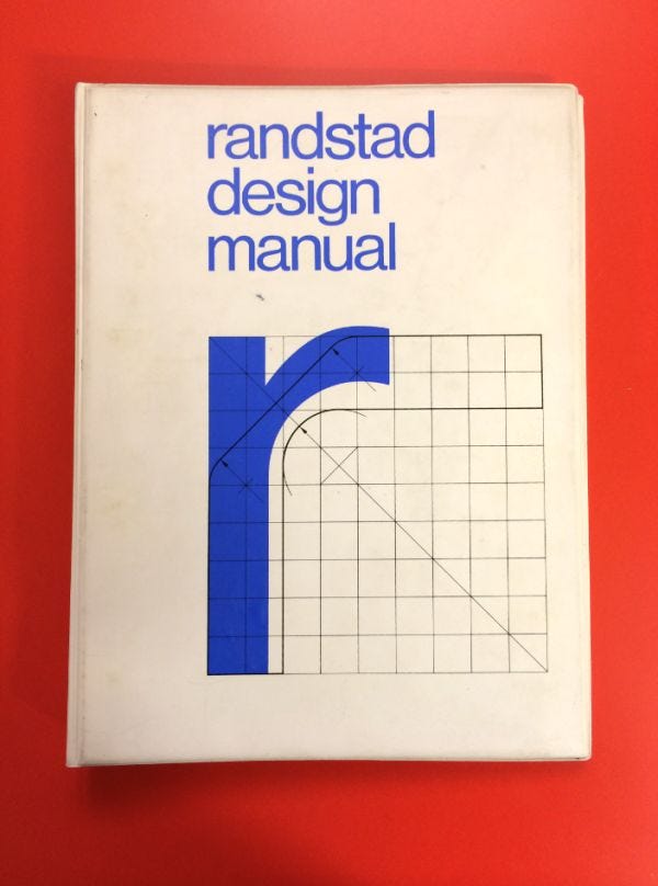
Here it was great to see original Randstad ephemera, living in the UK I didn't really know what the Randstad company was, (until I moved over here) all I could do was admire the graphic design, specifically the logo and its usage. To me the Randstad logo is the image of the late Ben Bos. This 1972 design manual, although only the front cover being visible, was one of my real highlights of the exhibition especially after his death earlier this year. Further in the exhibition were several other Randstad brochures, posters and leaflets.

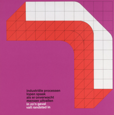


In this section there were more of the bigger names of Dutch graphic design like author and illustrator Dick Bruna – creator of the children's books Nijntje, Total Design co-founder Benno Wissing and the abstract yet geometric typography and prints of Karel Martens which were great to see, its always a good sign when you see new things by people you know of.


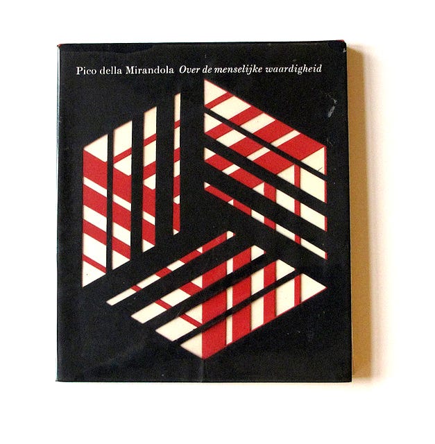
But for me it was also a great change to learn about some Dutch graphic designers I wasn't aware of.
It is impossible for any one person to know every single graphic designer over history and if you were to know them all and their work then you would never be able to learn new things like this.
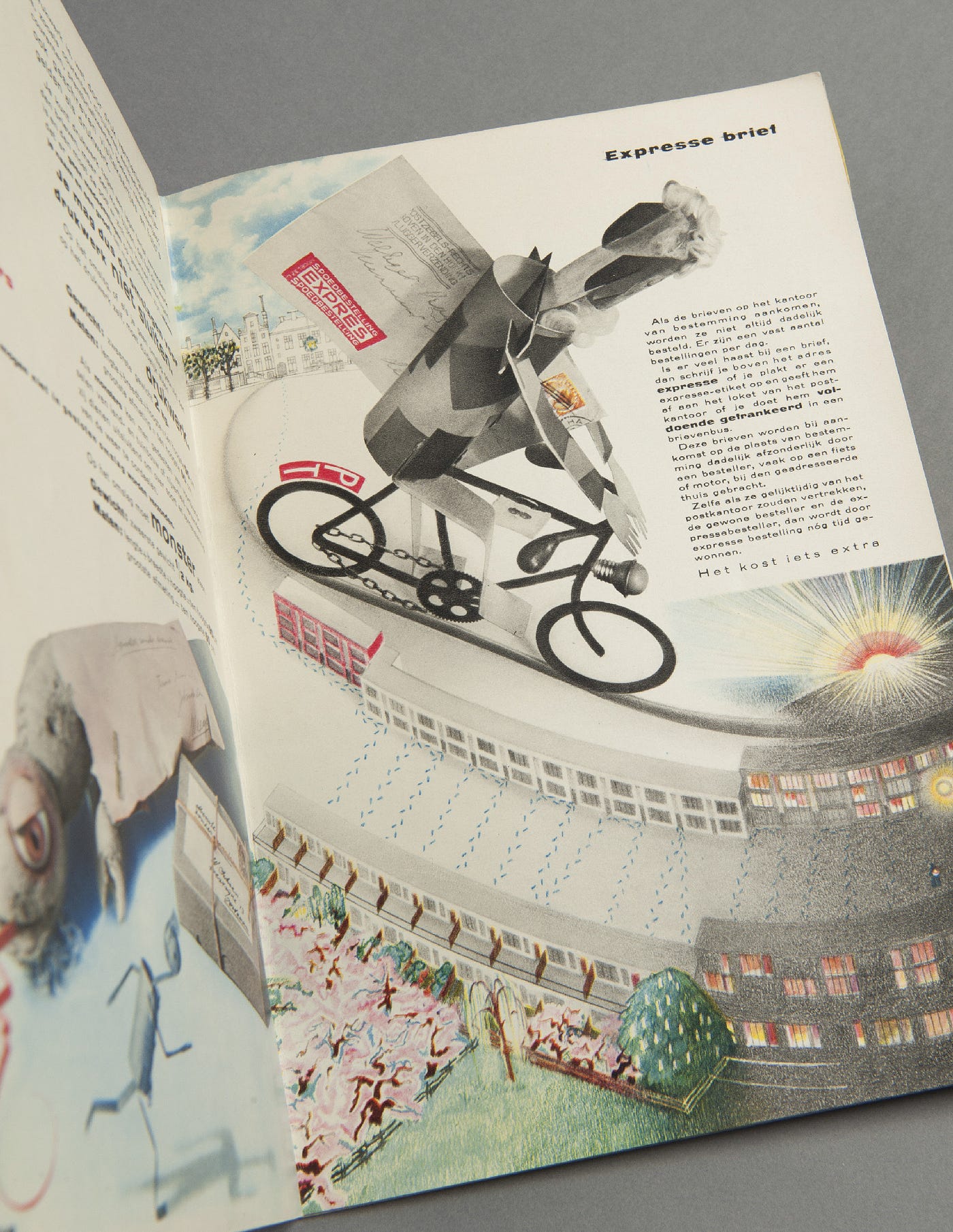
A lot of work displayed was by Dick Elffers which reminded me a little bit of British design in its layout and order as well as the way type is treated alongside image. Specifically here I am talking about the Philips 'Waar ook' brochure. The duo-tone imagery with overlaid type and body copy. Also the use of cutout photographs in a collage effect. It reminds me a lot of a project me and my collaborative partner did at university. A collaborative book for the PTT 'Het boek van PTT' with Piet Zwart was also pretty special, again using collage and photo montage with illustrations and sketches.
Will van Sambeek is a new name for me also. A young designer who was fascinated by the Dutch avant-garde and post-war Swiss designers. Some of his better known work is own display, posters for the Van Abbemuseum after Wim Crouwel left. The poster for a Mario Sironi 1964 exhibition is a perfect example of mid 20th century modernism, clearly inspired by Swiss designers like Josef Müller-Brockmann. The bold and simple shapes of colour match the typography perfectly.


The rest of the exhibition covers in great detail the work of other 20th century designers and then onto modern day modernism. 21st century modernism here is covered mainly by the Amsterdam studio Experimental Jetset. Established in 1997 the collective's work has strong conceptual focus. A lot of their work is typographical with modernist values, it is often seen in the cultural sector. On display is physical pieces for their 2013 graphic identity for the Whitney Museum which is a perfect identity for the museum due to it looking so modern and contemporary. A confident and responsive W is the cornerstone of the identity which can be reimagined for various formats.

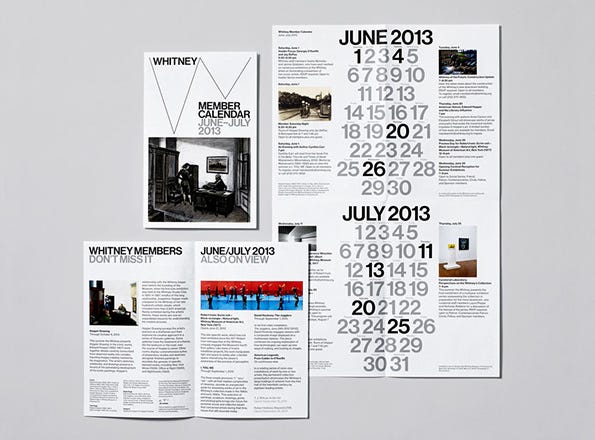


Also one of only a couple of pieces on display that I own (the other being stamps) is their recent book 'Statement and counter-statement: Notes on Experimental Jetset'. This book that I am still yet to fully read is a comprehensive study on the collective, their design ethos, values and principles and work they've created. It is less of a monograph as it is more of a personal archive, also containing written essays by Linda van Deursen, Mark Owens, and Ian Svenonius. There is also a small but fascinating publication 'Automatically Arranged Alphabets' pages of computer generated type compositions, each page using more letters of the alphabet.
Also as part of the exhibition at the Bijzondere Collecties is a section by Dutch graphic designer, Hansje van Halem. She is known for her impressive and bold patterns using stripes, waves, circles and also her experimental style of typography. Her recent work adorns the walls and ceilings in the 'crypt' section of the building with low ceilings — every surface covered in a different pattern. Also here is her spectacular recently published book 'III' full of patterns and graphic shapes, the construction of the book is equally as flamboyant printed using 28 Pantone colors, digital print, rise print and foil print — a real spectacle and beautiful piece to hold. There are also scale models of her huge typographic piece at the Tugelaweg as well as her recent work for the Lowlands Festival.
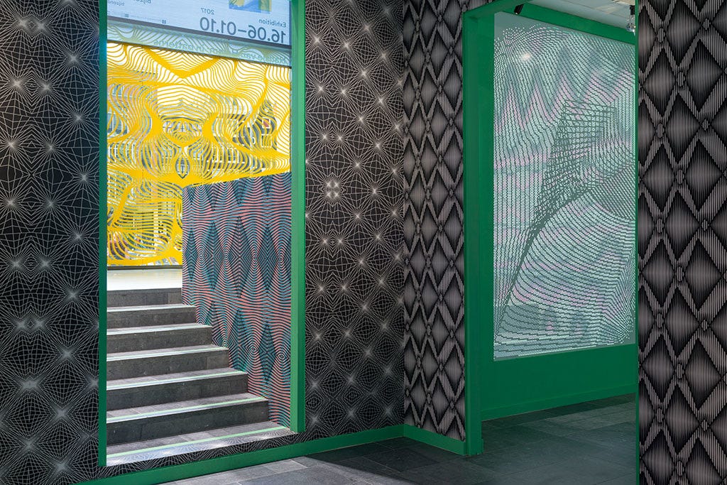

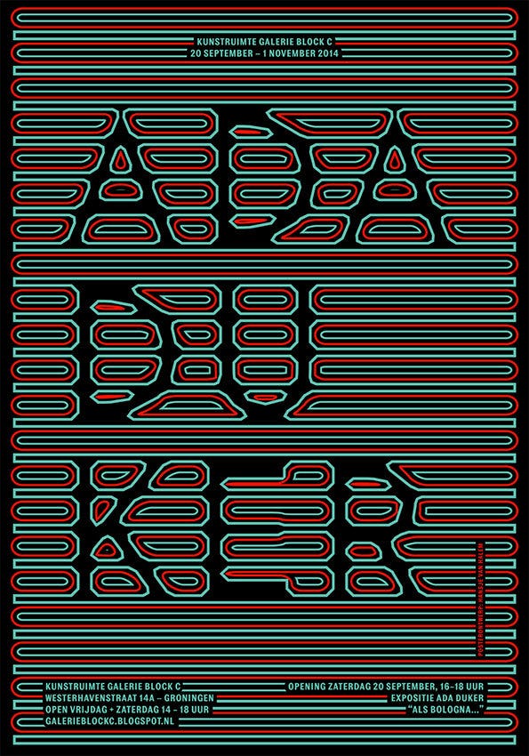


Modernism: in print/Hansje van Halem: in patterns, is on at the Bijzondere Collecties until the 1st October and is perfect for any graphic designer with the smallest interest in design history, its impossible not to be inspired by what is on show.
Modernism in Print Dutch Graphic Design 1917 2017
Source: https://craigberry93.medium.com/modernism-in-print-759ad9d26480
Post a Comment for "Modernism in Print Dutch Graphic Design 1917 2017"